Strawberries, emotions and artificial intelligence
Strawberries, emotions and artificial intelligence

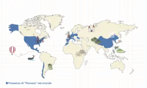
Planasa is a leading international group of companies in the development of new varieties of berry, satisfying demand in various markets. The group has four R&D centres located in different geographical areas.
With ownership of more than 1,500 hectares of land around the globe, chosen for soil quality and local climatic conditions, Planasa is one of the largest cultivators of berries (especially raspberries and blueberries), asparagus, avocados and endives in the world.

The need
Our work focused on the Candonga strawberry, grown in Basilicata. This biological strawberry is 100% sustainable, being the product of good cultivation by its growers, the best climatic conditions and the soil of the Metaponto plain. The Candonga strawberry is the flagship product of Planitalia, the Italian branch of Planasa. In order to increase the value of the Candonga brand, management thought it necessary to update the logo and commissioned a specialist agency to create a new trademark. Internal opinions were divided about the need to change the logo, keep the current version or return to the traditional version, which was even older.
The solution
Sagres was engaged to determine which logo was most suitable for identifying a product as representing Italian excellence.  We recognised immediately that the research target was the end consumer and that the critical aspect was the capture of emotions, prompting a customer to buy one product instead of another; accordingly, we recommended a market analysis. The consumer is a person and, as such, decides whether or not to purchase based on personal perceptions, which are greatly influenced by personal emotions and the information available when making the choice. Indeed, when questioned on a specific topic, we all express our personal emotions via the words we use to describe the subject mentioned. Normally, when addressing needs of this type, the methodologies used involve the creation and observation of one or more focus groups. This solution is often very expensive and time consuming. Instead, we created and adopted a methodology based on the recording of interviews with end consumers, enabling us to capture all the words used and then, via special Voice2Text software, transcribe the audio file. This process avoids the partial capture of consumer opinions, as so often happens when operators take note of and summarise the feedback received, thereby losing the genuine reaction and compromising the completeness of the t
houghts expressed. After transcribing the interviews in full, we applied the AI of a specialist text analysis software to explore the reasons for the stated preferences. In this case, the key was not only to understand which logo was preferred but, above all, the reason why. This aspect was absolutely essential in order to give proper input for the restyling, as necessary, of the winning logo. Having defined the sample size and prepared the visuals needed to show the different logos to end consumers, we invited our operators, armed with microphones, to visit the local markets and street stalls where fruit is purchased. Each consumer was first asked whether or not they had heard of Candonga (brand awareness research) and then shown the three logos, requesting a score from zero to ten for each and the reasons for that score, regardless of whether it was high or low. Later, the results were analysed using our established criteria for measuring Customer Experience, applying in particular the Net Promoter System.

The results
The results of this research, which involved several hundred end consumers, enabled management to make an informed choice. The “Voice of customer” gave clear indications that, importantly, were explained by analysing the words and concepts used (frequency and association with low and high scores), making it possible to decipher the decision-making model that prompted strawberry consumers to choose one punnet rather than another. Additionally, the analysis provided ideas for the restyling of the preferred logo that, as unanimously agreed by the interviewees, needed to be made more immediate: red strawberry with green leaf on a white background, thus suggesting the colours of the Italian flag and associating immediately the logo, the product and the idea of quality inherent in Italian products and “Made in Italy” in general.
Planasa

WE ARE READY TO
listen
Siamo pronti ad
ascoltarvi
Complete the form
Receive our business presentation immediately.
An advisor will contact you soon.